Wednesday, November 3, 2010

Layar Updates


Last time I tried to use Layar I was very far away from the model and I was still underground and could not see the whole model. This time I scaled it down and it worked much better.
Here are the rest of the Layar images I have captured using the different QR codes I made:


Monday, November 1, 2010

Interactive PDF Image Capture

Printable PDF


Download Files Here

Interactive PDF Poster:
http://www.filefront.com/17464513/3333620_InteractivePDF.pdf

Printable PDF Poster:
http://www.filefront.com/17464515/3333620_PrintablePDF.pdf

Final 3DS Max Model of Vitra Re-Envision:
http://www.filefront.com/17464517/3333620_final3dsmaxmodel.max

References

Village Green Images:
http://www.ceem.unsw.edu.au/content/userImages/TheVillageGreenatUNSW.jpg
http://www.cricket.unsw.edu.au/Photos/Green%20Shield%20v%20CC.JPG
http://www.unswbaseballsoftball.com/pb/wp_ea6df524/images/img73745c5a1245acb2.jpg
http://lh3.ggpht.com/_s0bnlxQ8dr0/Rpt7siwRxvI/AAAAAAAAAEk/eJaWAJ86m0g/IMG_0165.JPG

Frank Gehry and Vitra Design Museum Research:
http://www.galinsky.com/buildings/vitradesign/index.htm
http://en.wikipedia.org/wiki/Frank_Gehry
http://www.greatbuildings.com/buildings/Vitra_Design_Museum.html

Links on Interactive Poster Lead To:
http://www.galinsky.com/buildings/vitradesign/index.htm
http://www.design-museum.de/museum/ueberuns/index.php
http://rebeccapennarch1390.blogspot.com/
http://www.unsw.edu.au

Animations for Interactive PDF


Renders Video


This is a video showing all of the renders I took of my Vitra Re-Envision model for Assignment 2 for ARCH1390. The music is The Scientist by Coldplay.

Text Drafts

Panel 1:
This new addition to the buildings of UNSW is to serve
the purpose of a new Graduate School. The form was
inspired by Frank Gehry’s famous Vitra Design Museum.
The structure will stand at around 50 metres in height,
and the area above ground will be completely sustainable.
The area below ground is accessible through a spiral
staircase, and will contain areas for tutorials to be held.
The Vitra Graduate School will be a great asset to both
postgraduate students and lecturers at the University of
New South Wales.

Panel 2:
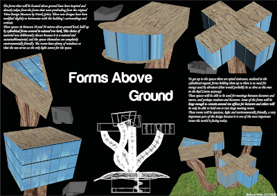
The forms that will be located above ground have been inspired and
directly taken from the forms that were prodruding from the original
Vitra Design Museum by Frank Gehry. These new designs have been
modified slightly to harmonize with the building’s surroundings and
context.
These spaces sit between 30 and 50 metres above ground level, held up
by cylindrical forms covered in natural tree bark. This choice of
material was deliberately chosen because it is a natural and
sustainablematerial, and the spaces themselves are completely
environmentally friendly. The rooms have plenty of windows so
that the sun serves as the only light source for the space.
To get up to the spaces there are spiral staircases, enclosed in the
cylindrical organic forms holding them up so there is no need for
energy used by elevators (that would probably be as slow as the ones
in the Red Centre anyway).
These spaces will be able to be used for meetings between lecturers and
tutors, and perhaps students and lecturers. Some of the forms will be
large enough to contain around ten offices for lecturers and others will
be only be able to hold one or two large meeting rooms.
These rooms will be spacious, light and environmentally friendly, a very
important part of the design because it is one of the most important
issues the world is facing today.


Panel 3:
The spiral staircase is an important
recurring theme in this re-envision of
Frank Gehry’s Vitra Design Museum.The
spiral staircase in his building is one of the
most memorable protruding elements of the
whole design, so in this re-envision of the
museum spiral staircases are used in several
areas.
The underground part of the design
is made from similar
materials to the spaces
above ground, in keeping with the
theme of environmentally friendly and
sustainable working spaces. The walls are
made from planks of wood, with the ends
of them facing the inside of the space. This
will be a good natural source of insulation
for the space below ground. The floor will
be made from the same
natural and unpolished
wood that has been chosen
for the outside of the forms above the
ground. The spiral staircase is also covered
with the same bark that covers the organic
cylindrical shapes that hold up the spaces
above ground. These hold the other spiral
staircases of the building, and this connection
between the different staircases creates integrity in the
design of the Vitra Graduate School for UNSW.

New QR Code for Far Away Shot


URL:layar://georssgateway?SEARCHBOX=http://tinyurl.com/27by8dr&SEARCHBOX_2=-33.918269&SEARCHBOX_3=151.228855
Coordinates: -33.918269,151.228855

Sunday, October 31, 2010

Testing QR Codes


The first image shows what the model looks like inside (the underground part) and shows the work benches and spiral staircase.
The second image shows what it looks like when I look up to see the models that are located above ground. These are not shown very well in this Layar so I will have to investigate how to make this part of the model better and easier to see using Layar.

Layar and QR Codes

Model Coordinates:
-33.918363,151.227933

Tiny URL:
http://tinyurl.com/27by8dr


QR Code 1:

URL: layar://georssgateway?SEARCHBOX=http://tinyurl.com/27by8dr&SEARCHBOX_2=-33.918305&SEARCHBOX_3=151.228147
Coordinates: -33.918305, 151.228147

QR Code 2:


URL: layar://georssgateway?SEARCHBOX=http://tinyurl.com/27by8dr&SEARCHBOX_2=-33.91855&SEARCHBOX_3=151.228102
Coordinates: -33.91855, 151.228102

Layar Model Screenshot

Progress with Poster Design

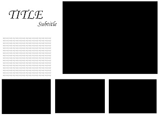
In these image captures you can clearly see the grid I am working with for this poster, and the progress I am making with the overall design and balance of each panel to make one coherent poster.


Thursday, October 28, 2010

Some Initial Renders and Screenshots

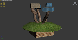
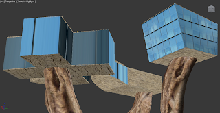
Some of the renders I have taken look ok, but the renderer is mental ray because I dont have the vray plugin and some of them dont look very realistic. So I have also taken some screenshots which I might use in the poster also because the materials and lighting look significantly better at certain angles in these than the renders.
Here are some renders:


Here are some screenshots:

Reowrking Layout


This set up of elements makes the posters more consistent as one whole document because the grid is clearer and the same shapes are used throughout the design. I think this will work better than my last idea. The grid I am using is 3x3 for all panels, but using it slightly differently on each one.

A1 Poster Layout Ideas

These are my first layout ideas for each page of the 3 A1 posters:

Wednesday, October 20, 2010

Concept Behind Re-Envision

I have heard that there is to be a Graduate School in a few years at UNSW, so this is the reason behind this redesign of the Vitra Design Museum. The main design of this structure will be based on the protruding forms of the Vitra Design Museum, and will be modified appropriately for the context. This building will stand out from the ones surrounding it as the forms will be unique and memorable. The materials for the building will be mostly natural in order to not deter away from the shapes of the organic forms themselves, and also to address the issue of sustainability of materials, a very real and current issue the world is faced with today.
This new building will stand around 50 metres in height and will have 4 main spaces above the ground. These will all be accessible through separate spiral staircases. There is also a space below ground that is not visible but is accessible through a spiral staircase in a hole in the ground, leading from the grass area below the other forms of the building. Because of the lack of elevators, and the fact that the spaces can easily get all their light through large windows that are spread generously through each space above ground, the building is self-sufficient and environmentally friendly.

Monday, October 18, 2010

A3 Expressive Montage


References:

http://www.ceem.unsw.edu.au/content/userImages/TheVillageGreenatUNSW.jpg
http://www.torabiarchitect.com/parametric_array/images/multiturn_spiral_stair.jpg
http://latimesblogs.latimes.com/photos/uncategorized/2009/02/02/trees.jpg
http://www.mccullagh.org/db9/10d-16/aspen-trees.jpg
http://www.teachingideas.co.uk/maths/files/shapes2a.gif

10 Textures

These textures were chosen because they are mostly made from natural materials (besides the concrete and glass). This is important to my concept because these shapes that I was focusing on are the main aspect of the re-design so these materials are supposed to not stand out past the actual shape and forms of the spaces.
The 10 textures shown include glass windows, bark, grass, polished wood, wood ends, concrete, grainy unpolished wood, bamboo, thatched roof and wood planks.
(all textures retrieved from www.cgtextures.com on 18 October 2010)

Sunday, October 17, 2010

Sketches for ReDesign Ideas


Parts of the Vitra Museum that stick out are extruded and these are the only parts visible from above ground. People can travel down these parts to get to the space below.

This shows an idea derived from a Library in Paris, with spaces suspended in a glass box.

This shows an idea that is kind of like skewers, with elevators in the poles leading up to the spaces above. This would be a very tall structure.
This shows the idea like the Seattle Library, showing the boxes and then how I might join them together to make a building.

My favourite of these 4 designs is the first one. It means that I can create 2 different Layars and it creates a dynamic landscape with a secret!

Wednesday, October 13, 2010

Seattle Library: Link Boxes Idea


Source: http://architectureinmedia.files.wordpress.com/2008/03/model_interior_boxes_01.jpg


Source: http://farm5.static.flickr.com/4013/4279209498_0dc71681e4.jpg

Here they have modeled the main boxes/spaces of the building and the second image shows how they have then linked them together; like connecting the dots.

Thursday, October 7, 2010

Inspiration for Vitra Re-Envision


Source: http://www.arch.virginia.edu/faculty/portfolio/van_lengen/image05_sm.JPG


Source: http://rapidcow.com/wp-content/plugins/wp-o-matic/cache/a62ee_orestad-high-school-1.jpg


Source: http://2.bp.blogspot.com/__m4wg-nDAMk/SoLgy6iiucI/AAAAAAAADzI/c3AcBJw1uBU/s400/AR+Schools+07.jpg


Source: http://www.e-architect.co.uk/images/jpgs/england/birmingham_central_library_bq020409_chd.jpg


Source: http://www.edinburgharchitecture.co.uk/images/jpgs/bankton_primary_school_arcade270109_1.jpg


Source: http://ireland.archiseek.com/buildings_ireland/dublin/swords/images/fingalcountyhall2_lge.jpg


Source: http://www.bustler.net/images/uploads/queensland_award_09_01x.jpg


Source: http://www.msa.mmu.ac.uk/continuity/wp-content/uploads/2007/06/47958155_bebd6e3385.jpg

Source: http://www.nahbmonday.com/CHBC/image_upload/eberswalde_technical_school.jpg

Source: http://www.omegadeltaphi.com/seattle2010/images/library.jpg

Source: http://lmnarchitects.com/assets/work/seattle_public_library/images/1hi.jpg?1231746158

Source: http://geocachiker.files.wordpress.com/2007/11/balcony.jpg


Source: http://cdn0.lostateminor.com/wp-content/uploads/2009/04/reverse-destiny-loft.jpg


Simmons Hall:


Source: http://www.digitaljournal.com/img/8/7/3/i/4/6/3/o/Simmons-Hall-MIT.jpg


Source: http://www.architizer.com/mediadata/projects/252010/project-gallery/7c8b580a.jpg


Source: http://moonshadow.mit.edu/RS/abstractSimmons1.jpg


Source: http://lh4.ggpht.com/_b7btrNkYZTo/STXRDzYvKUI/AAAAAAAAAH4/L7dW4iK8mhw/IMG_2361.JPG


Beijing National Stadium (Bird's Nest):


Source: http://www.kinabaloo.com/be17107726b.png


Source: http://blog.lib.umn.edu/crial002/architecture/fg/birds_nest.jpg


The Vitra Elements:

I am particularly interested in the areas of the Vitra Design Museum that stick out, and it is interesting seeing these examples above of buildings that are made of many elements sticking out of them. This would be an interesting way to design the new Graduate School for UNSW on the Village Green site.


The Site:


These are images of the site and the buildings surrounding it, investigating the context:

Source: http://lh4.ggpht.com/_rstE17oljSQ/Rcg8x2cA8TI/AAAAAAAABCs/jLImewOgAcQ/IMG_3702.JPG


Source: http://farm3.static.flickr.com/2552/3861390845_27f645df8b.jpg


Source: http://farm4.static.flickr.com/3513/3750878079_07c71be820.jpg


Source: http://image32.webshots.com/33/8/39/82/266183982gYqNOQ_fs.jpg